
In designing Airwallex’s new 16,000 sq. ft London headquarters, the ambition was to create a workspace that felt confident and established, and communicated this global fintech company’s scale and ambition.
Architecture-Led Design
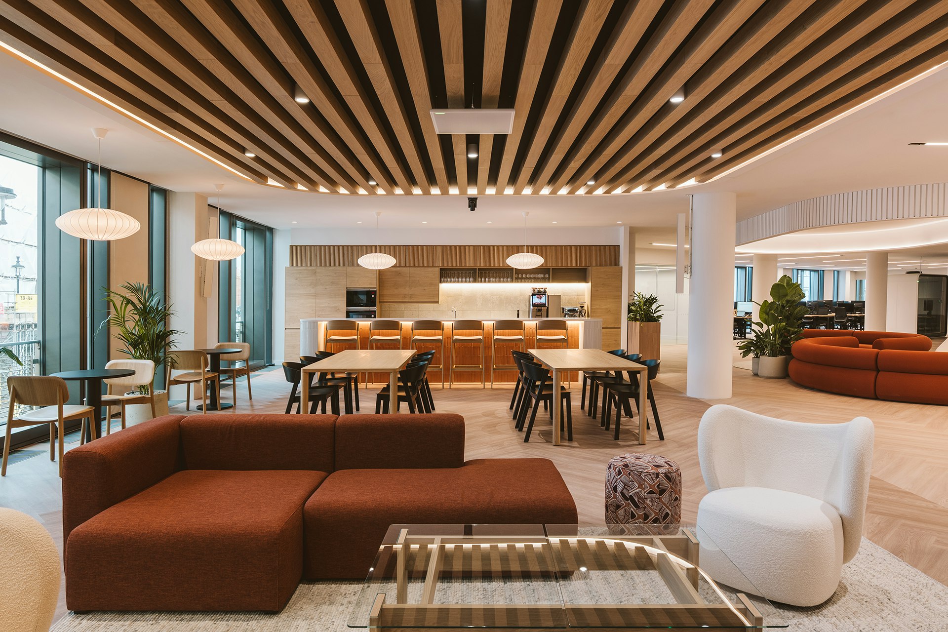
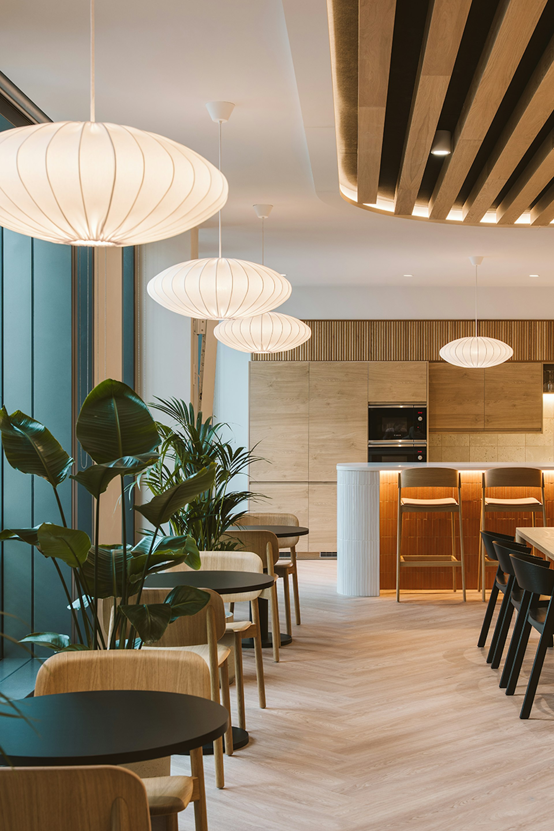
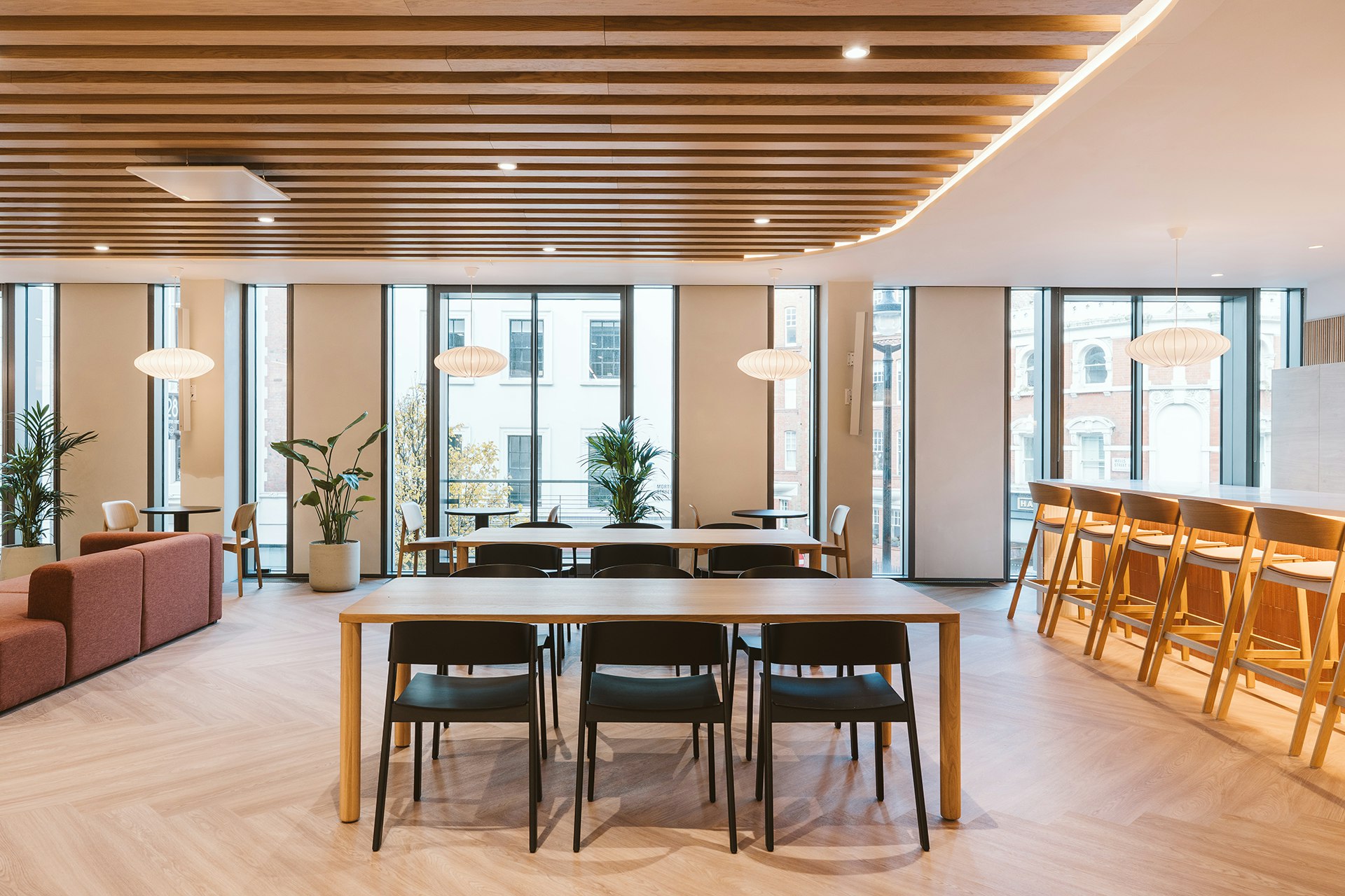
Situated on the first floor of the iconic Wells & More building, the design for Airwallex takes cues from the building's character, allowing its architectural presence to inform the interior response. With a wealth of natural light provided by the floor-to-ceiling windows and the building’s central atrium, the design uses material and light to shape the experience. Throughout the space, light tones of timber were chosen to complement the natural light, while the furniture and joinery sit consistently within a light, natural colour palette that maintains a sense of openness.
In the spatial design, the building’s natural light also informed the layout, with the central social hub positioned nearest the atrium, creating a visual and spatial ‘pull’ for users. The use of glazing continues into the meeting rooms to maintain this openness and maximise daylight, ensuring each room feels connected rather than segmented from the rest of the workspace.
The project demonstrates that identity can be architectural. Through clear planning, a consistent material language, and disciplined detailing, the workplace feels cohesive and human, supporting the culture of the business while responding honestly to its setting.
Embedded Brand Identity
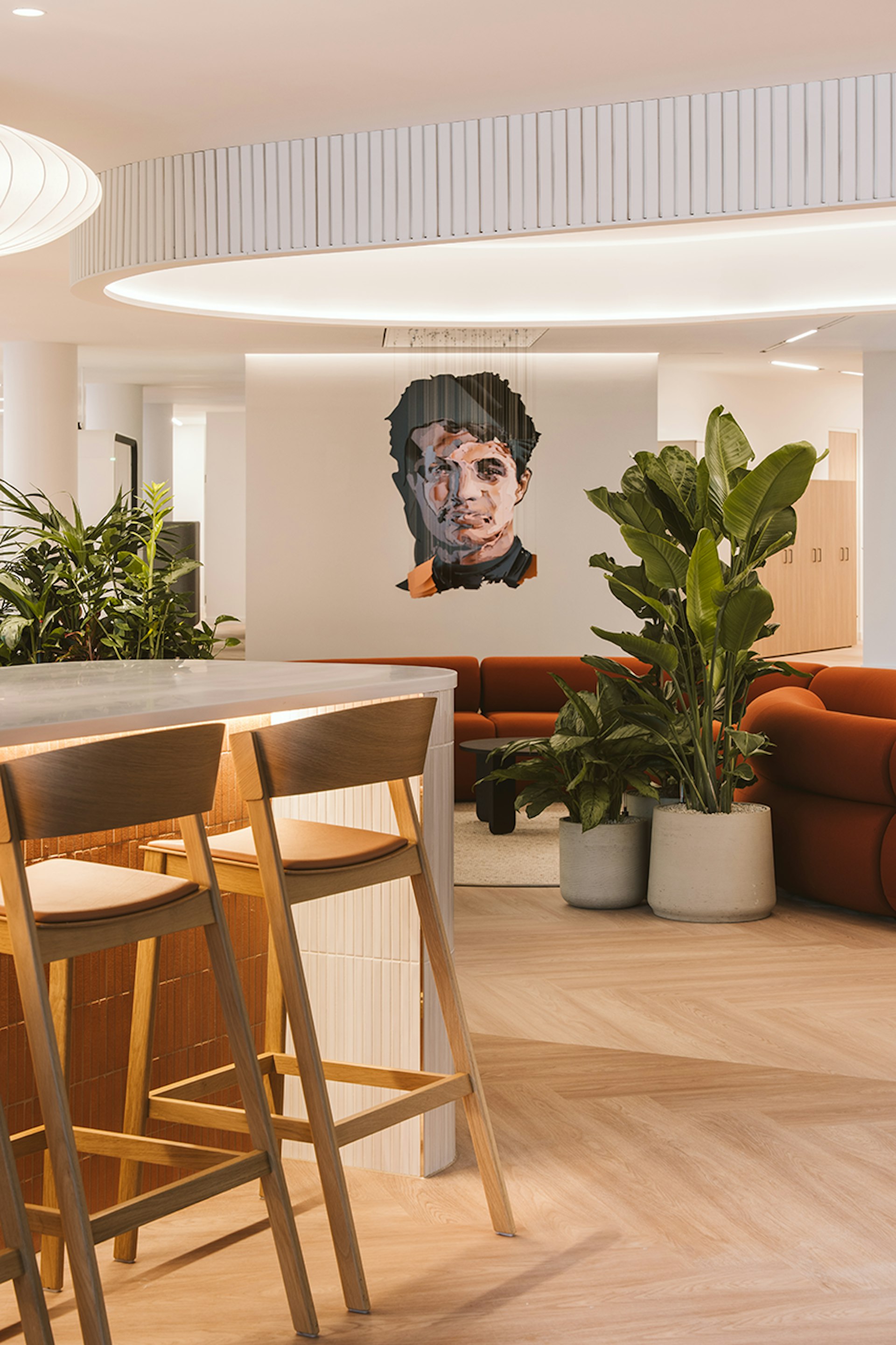
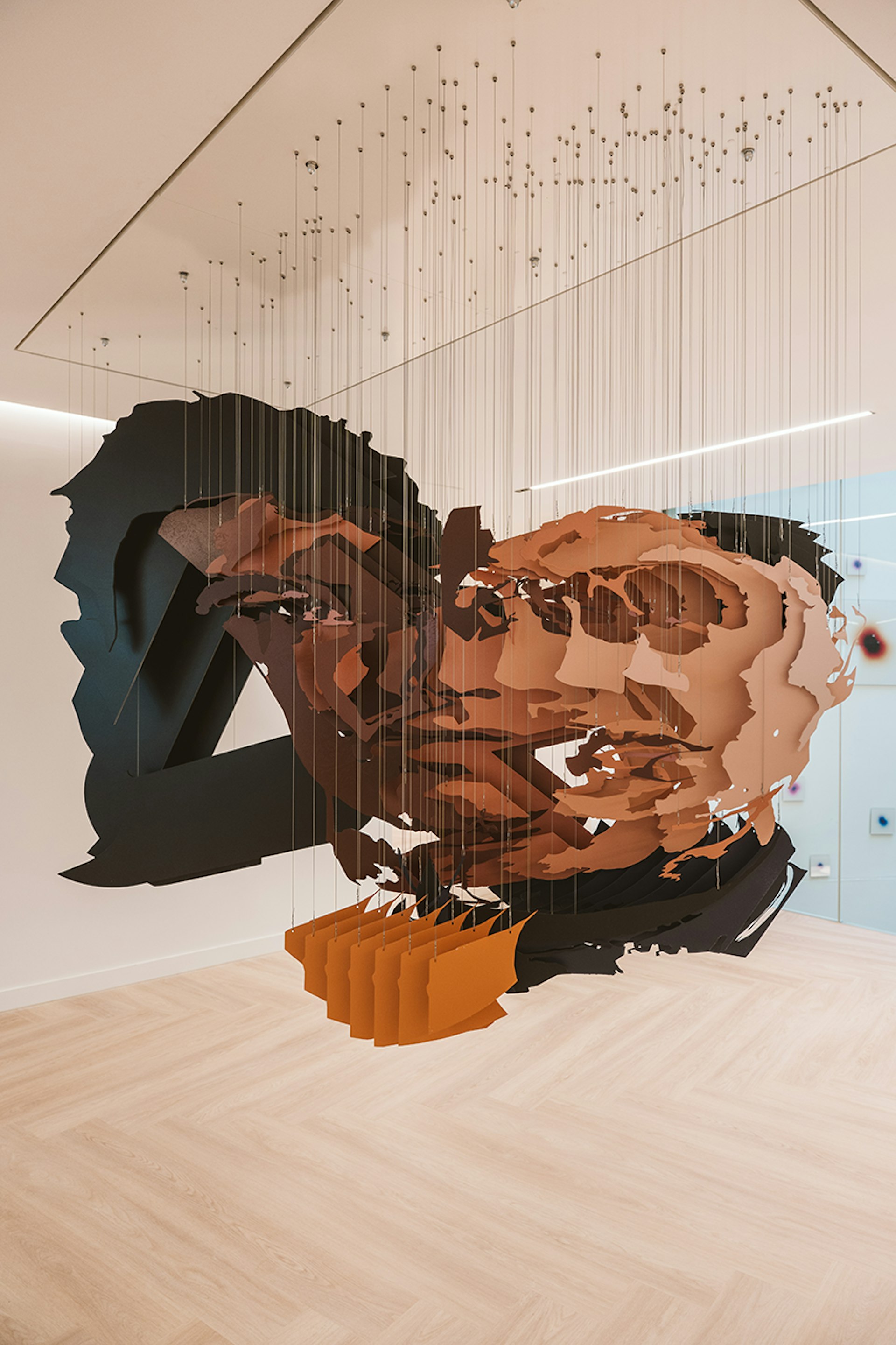
Integration was fundamental to the success of the project, with the brand’s identity embedded within the design rather than applied as an overlay. Instead of relying on graphics, the brand is expressed through crafted moments.
The bespoke Michael Murphy installation is a key example — an optical illusion that shifts from the Airwallex logo to the image of Formula One driver Lando Norris. Rather than existing as a standalone artwork, this was embedded into the architecture and spatial hierarchy of the space. Visible even from the building’s corridor, its shifting perspective reflects movement and global connection, reinforcing Airwallex’s partnership with Formula One in a way that is experiential rather than literal.
With the inclusion of artwork forming part of the initial client brief, the design was planned around the installation, ensuring it felt intentional and integral to the spatial experience.
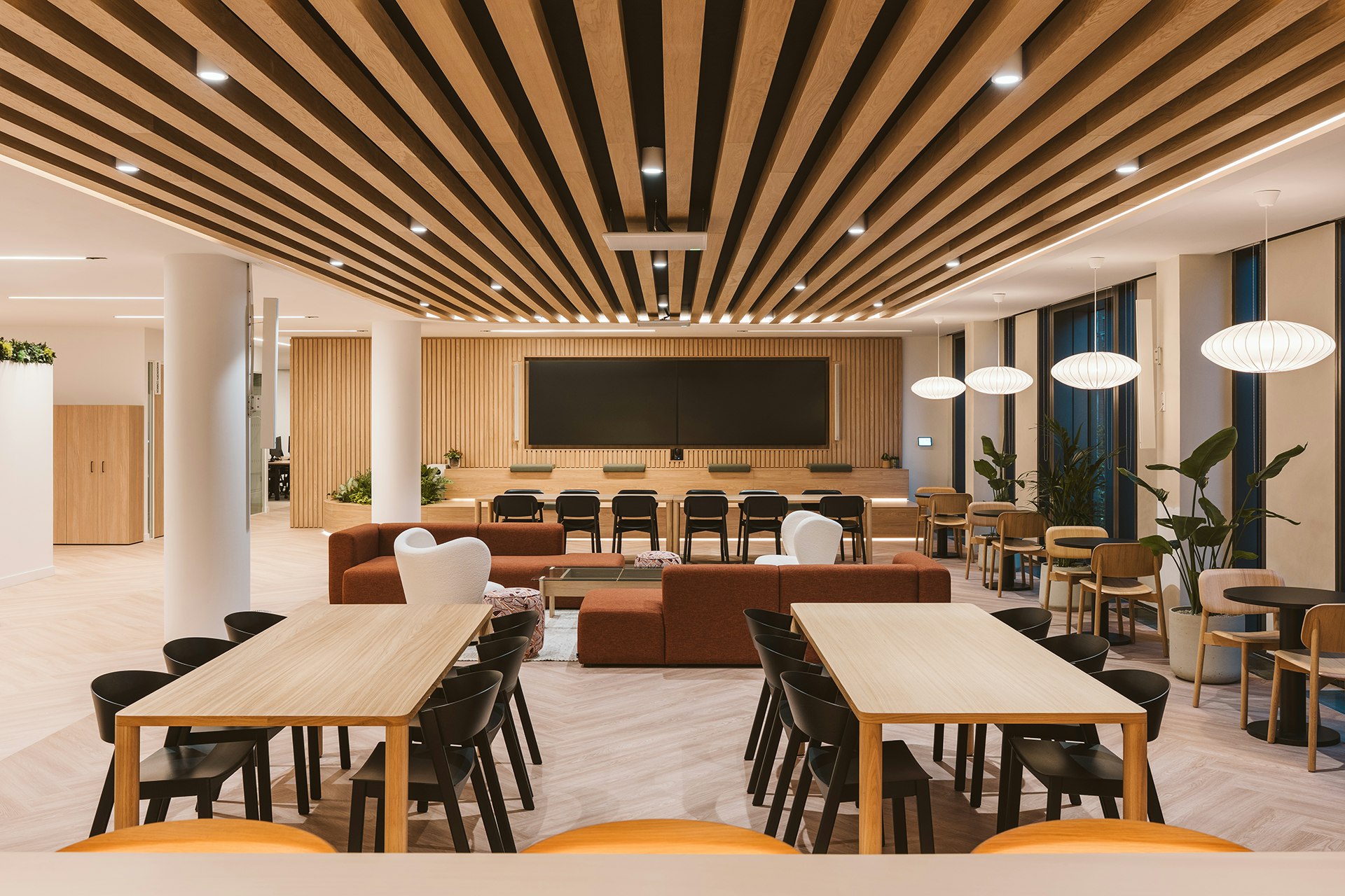
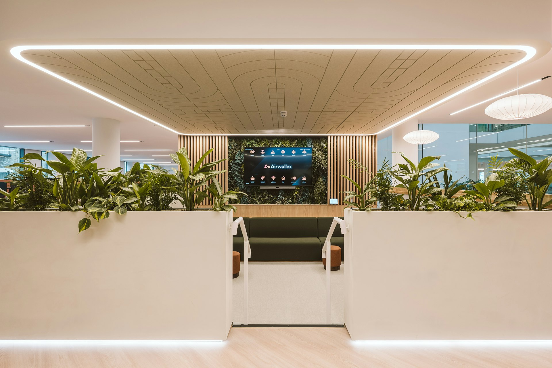
Zoning through Design Identity
From the moment of arrival, the layout reads clearly using distinct yet deliberate design language. Changes in lighting, joinery, and furniture typology signal shifts between collaborative and focused areas without the need for heavy wayfinding.
A key example is the use of bespoke ceiling joinery and integrated lighting to frame different areas. In the main social space, this is expressed through a timber slatted ceiling; in the reception area, through a halo raft with a bespoke LED lighting feature. In the conversation pit, a dropped ceiling featuring tailored acoustic panels defines the space.
While these varying joinery finishes distinguish each area, the material palette remains consistent and harmonious throughout, creating a recognisable brand and design identity across the entire workspace.
Material Efficiency and User-Centred Sustainability
Environmental sustainability was central to the project, beginning with the decision to work with the existing fabric of the Wells & More building. By retaining the base-build structure and maximising the reuse of existing elements, the design significantly reduced unnecessary demolition and embodied carbon. Rather than introducing major structural changes, the approach focused on careful material layering and internal reconfiguration.
Materials were selected for durability and longevity, with timber finishes, robust joinery, and high-quality surfaces specified to age well and minimise replacement. A controlled material palette further reduced waste and simplified procurement, while suppliers were selected, where possible, based on their environmental credentials and commitment to responsible sourcing.
The design also prioritises user wellbeing through warm materials, access to natural daylight, and clear spatial organisation, allowing users to intuitively navigate the space with ease. This clarity helps reduce stress and enhances the day-to-day experience. By integrating environmental restraint, long-term adaptability, and a strong focus on user experience, the project presents a balanced and pragmatic approach to sustainability.
We wanted to create areas people actually want to spend time in. Places where they can step away from their desks and interact.
Junal Barboza, Architect


Office’s should be more than just four walls, a ceiling, and some desk space.
With each and every project we redefine what make’s the workplace experience.
This website uses cookies
We use cookies to analyse the use of this website. For more information, see our Cookie Policy