Butternut Box
Creating the 'Best place you've ever worked' at Butternut Box
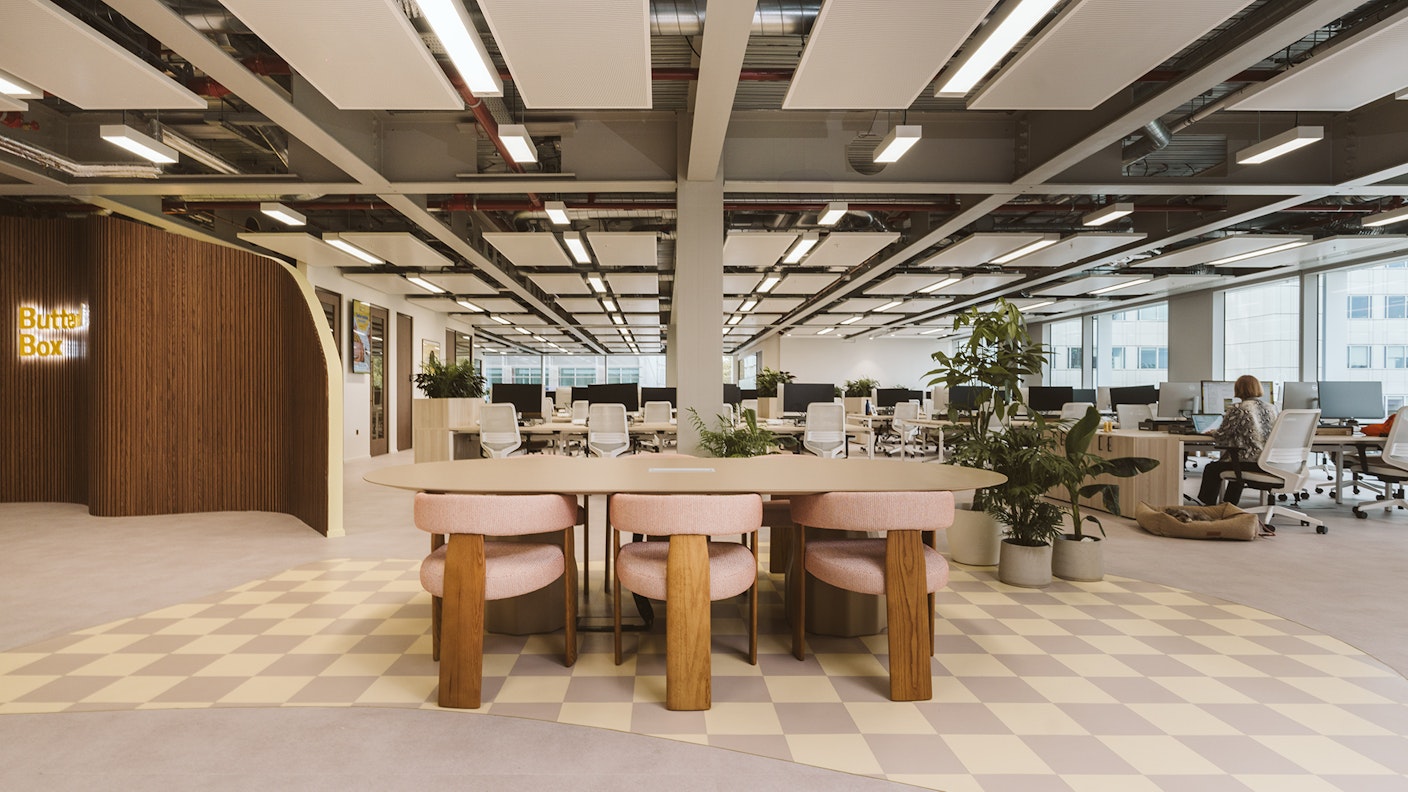
Functionality paired with playful aesthetics
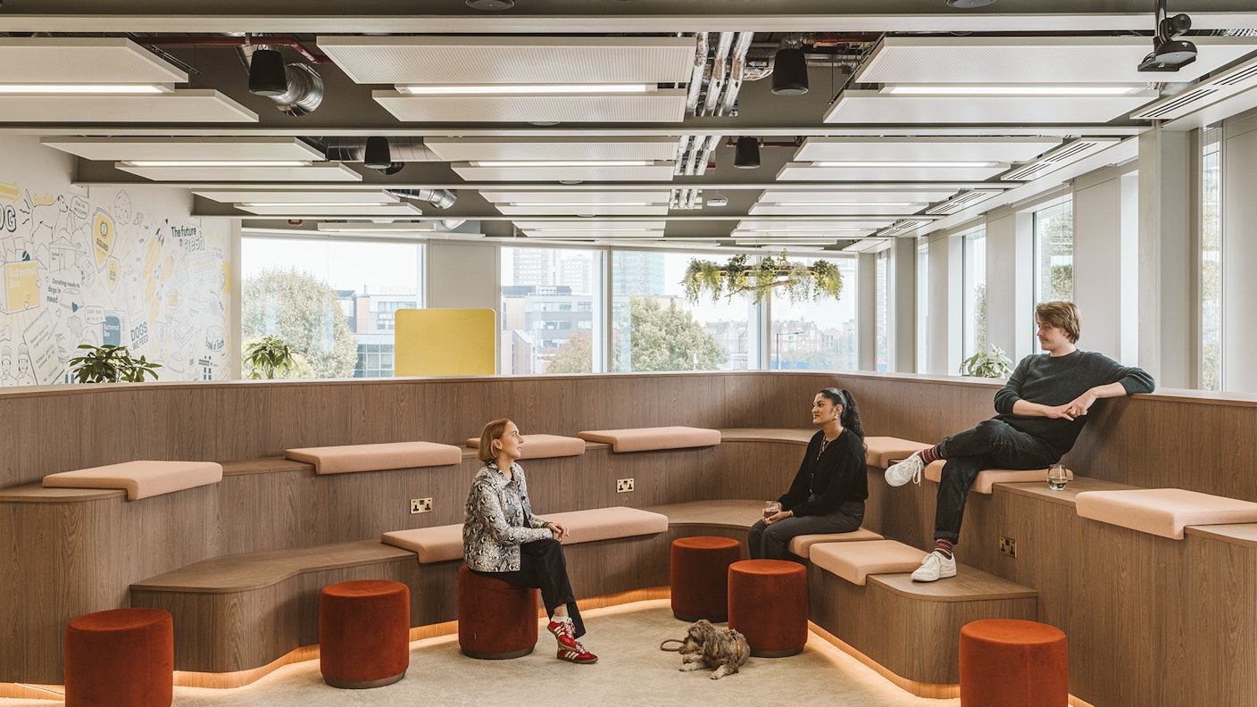
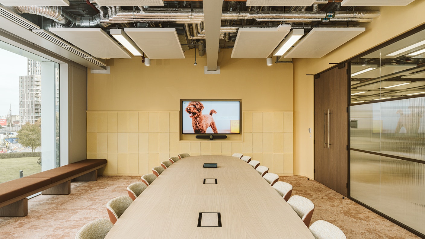
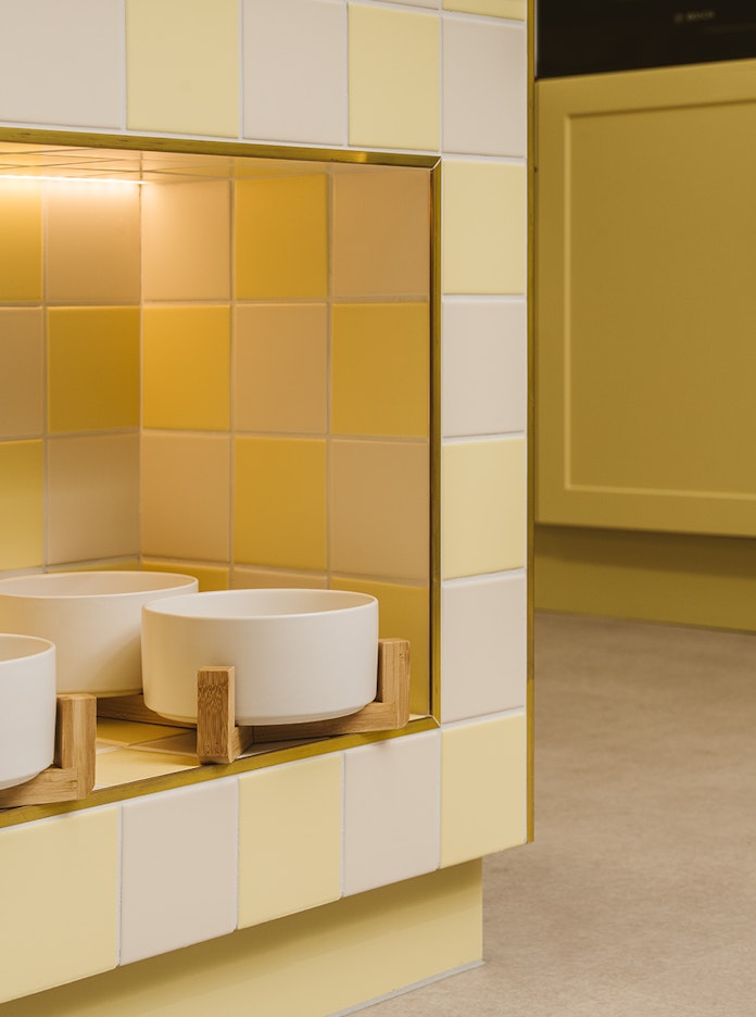
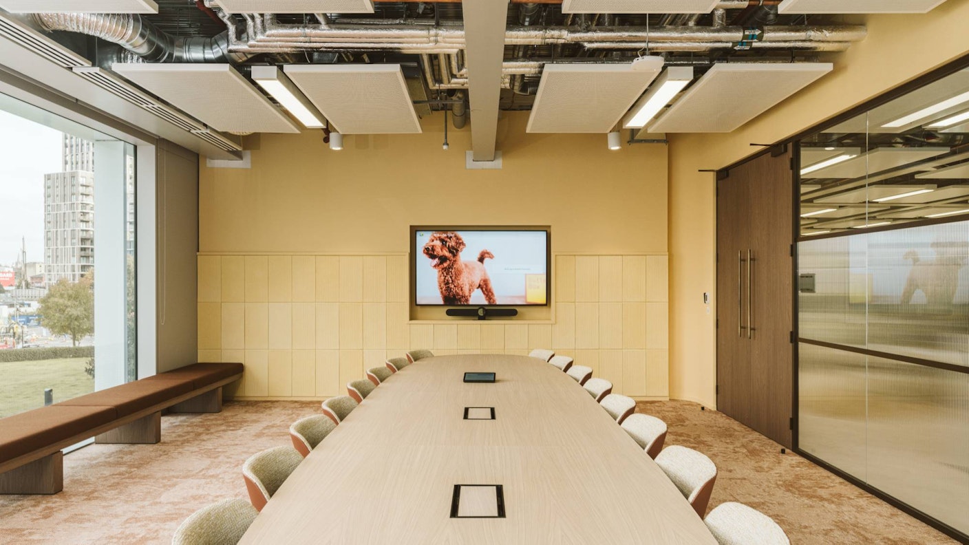
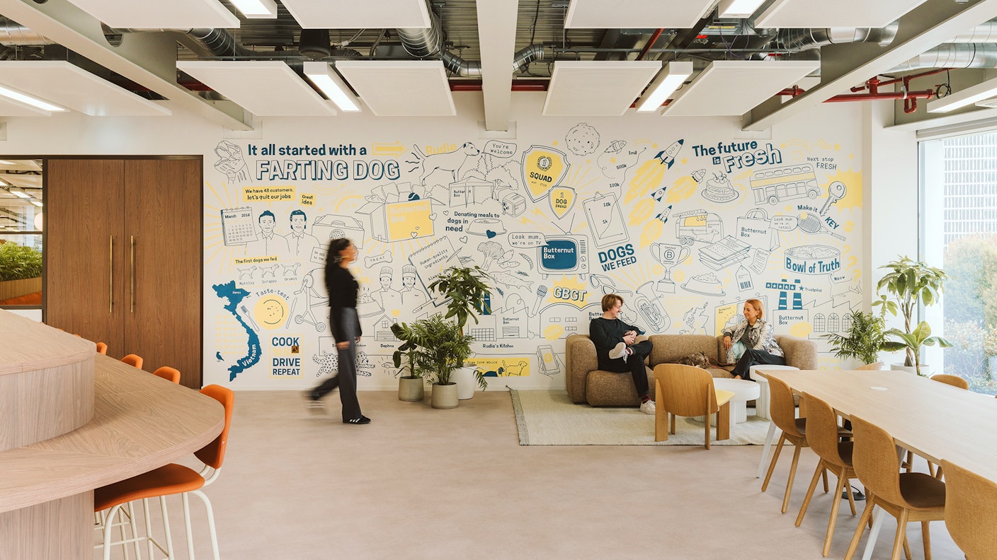
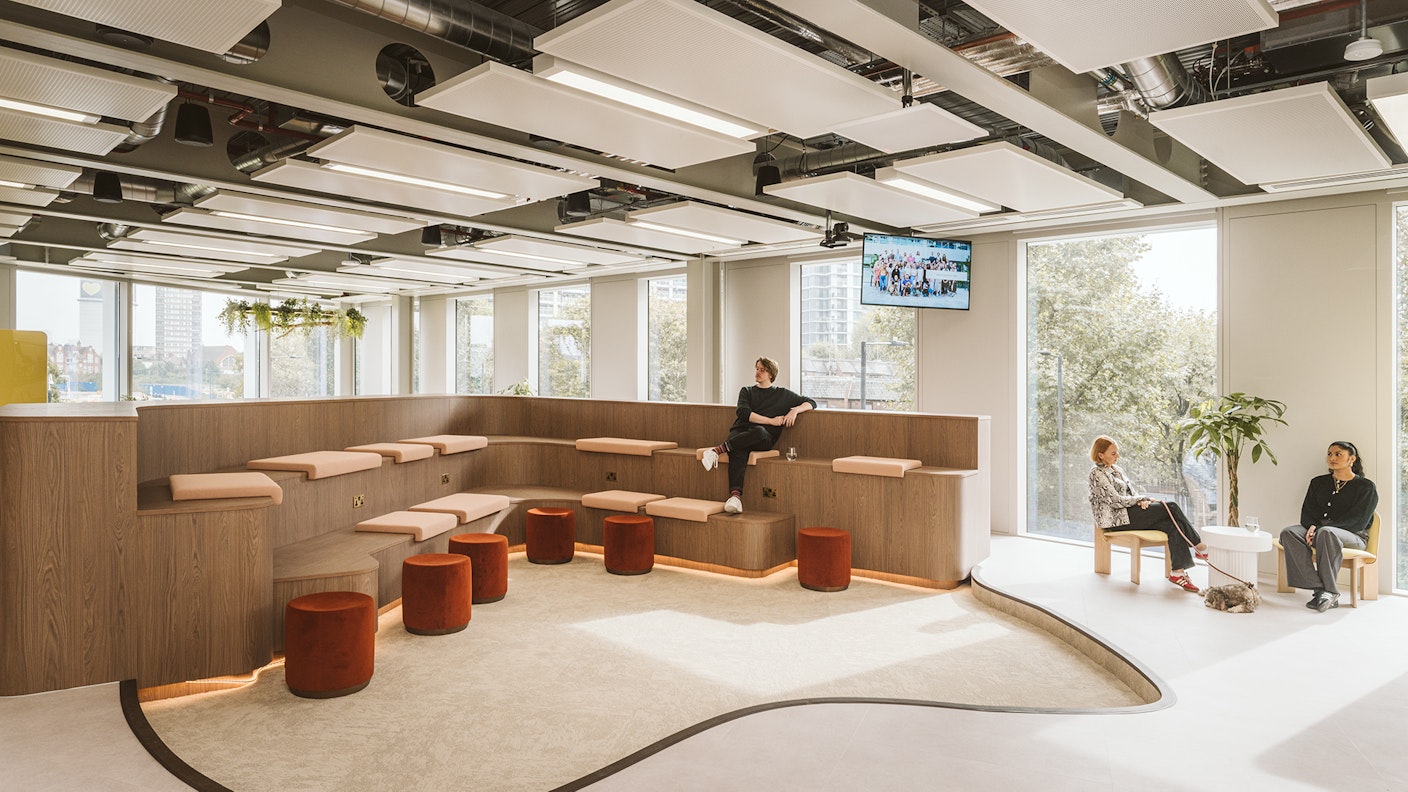
Butternut Box as a brand is playful and vibrant at it’s core, so when designing this scheme we knew that it was important to carry this sentiment through to the space. The colour palette reflects this, where the ‘Butternut Box yellow’ is elevated to a sophisticated, pastel yellow — seen most clearly in the checkerboard tiling in the kitchen area. The checkerboard tiling — a focus feature of the space, is a direct nod to Butternut Box’s product boxes and logo, which, alongside warm wood tones and panelling, cement the Butternut Box branding in to the space.
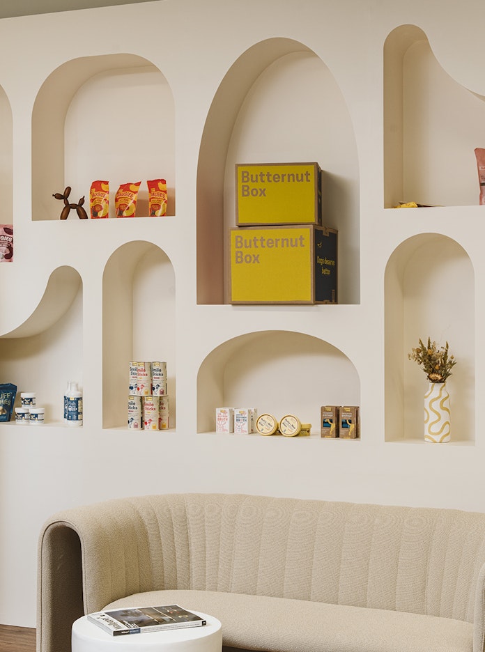
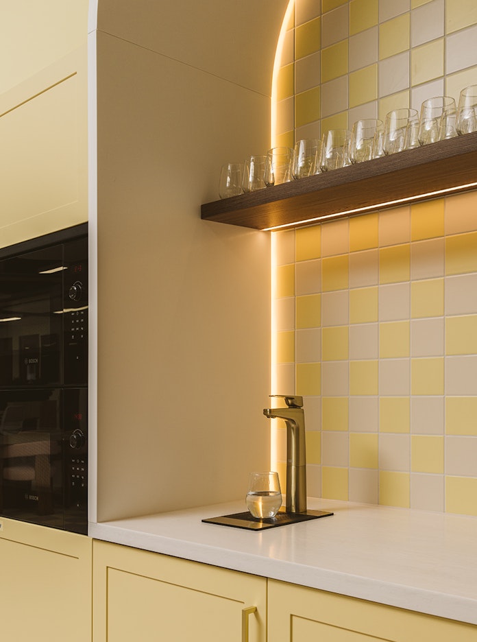
"Much like Butternut Box’s brand, the project intent has been to pair a deeply human playfulness with elevated, premium design. Together we’ve crafted a joyful space which can bring out the best in all users, whether they be two or four legged."
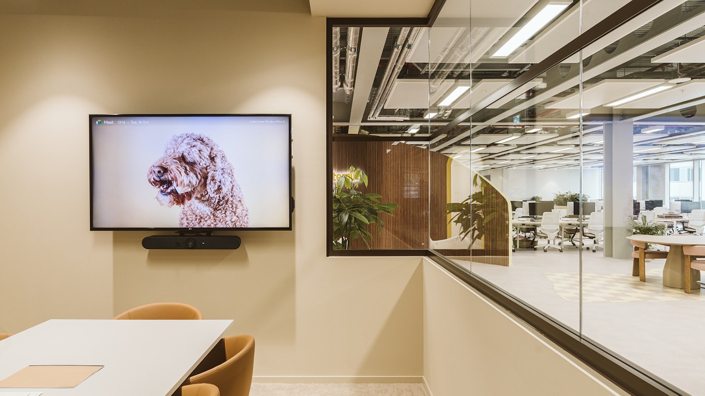
Design fit for the four-legged friends
With “dogs at the heart” of Butternut Box as a business, it was a no-brainer for our design to feature elements that provide comfort for the four-legged office users, while not compromising the employee experience. The inclusion of a dog-bowl ‘station’ in the kitchen, the resting places for dog beds, and lead hooks under all desks ensure that the needs of the dogs are fully integrated in the space. To reduce potential distractions, all meeting rooms feature lower glass sections to prevent dogs from seeing each other — alongside these features, the materials used throughout the space are dog-friendly, with most being wipeable and durable enough to withstand continued use from both people and their pets.